
Case Study
Abdul Qadir Shahab
Brand · Design · Strategy
Atalvi Gelato — Brand Identity, Visual System & Launch Strategy
Built a premium gelato brand.
Created the category to sell it.
Full brand identity, visual system, and go-to-market strategy. Priced 50% above local ice cream. Same range as Baskin Robbins. People still chose Atalvi, and kept coming back.
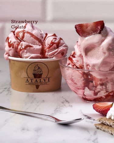
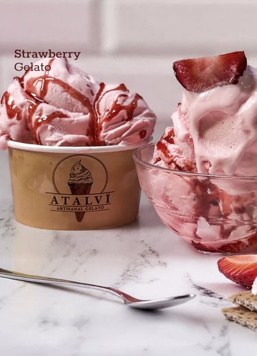
CLIENT
Atalvi Gelato
SERVICES
Branding, Design, Strategy
MARKET
Lahore, PK
YEAR
2024 — Ongoing
+50%
Premium held against local market, matched Baskin Robbins range.
~90%
Customer return rate after first visit
~60%
Of customers turned into regulars
№1
Top-ranked gelato in Lahore by Google reviews
01
THE PROBLEM
Launch a premium category in a market that only knows discount ice cream.
CONTEXT
Lahore had two extremes. Cheap local ice cream below. Global chains above. Gelato barely existed as a category.
Atalvi needed to land at 50% above typical local pricing, hold it, and make people come back.
> When the market doesn't know the category, the brand has to do the explaining. The design has to do the convincing.
02
THE APPROACH
Build the category through brand, design, and strategy.
FIVE MOVES
Five connected moves. Each one supported the others. None of them would have worked alone.
PILLARS
01
STRATEGY · OWN THE NICHE, JUSTIFY THE PRICE
Product positioning
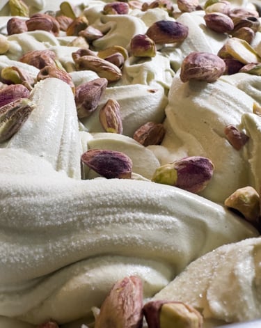
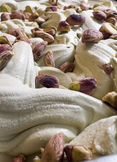
Found the gap between cheap parlours and global chains. Built Atalvi to fill it. Tight menu, strong hero flavours (pistachio, dark chocolate, kunafa). Premium tied to clear quality, not random branding.
Three scoops of local ice cream equalled one Atalvi scoop on volume. The math made the price logical.
02
DESIGN · LOOK ITALIAN CAFE, NOT LOCAL PARLOUR
Visual identity
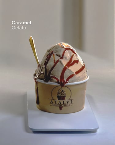
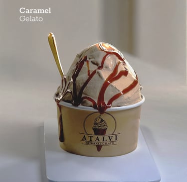
Calm palette: cream, brown, deep green. No neons, no cartoon colours. Refined logo and typography closer to an Italian bar than a dessert shop.
The visual language said it quietly: this is not what you usually buy.
03
STRATEGY · EDUCATE FIRST, JUSTIFY SECOND
Brand communication
Simple explanations of what gelato is. Less air, more flavour, real ingredients. Showed the difference without attacking competitors. Built a story customers could repeat.
Used real scarcity on small batches and seasonal flavours. It fit the craft story and reinforced the premium.
04
DESIGN + STRATEGY · CONTENT THAT CHANGES MINDS
Social and content system
Four pillars: education clips, close-up texture shots that made one scoop look worth the price, in-shop moments, and flavour drops for the existing fanbase.
Repeated until customers used the language themselves in reviews.
05
Brand world
DESIGN · Consistency across every surface
Every touchpoint reinforced the same premium positioning. The brand wasn't a logo. It was a felt experience from Instagram to spoon.
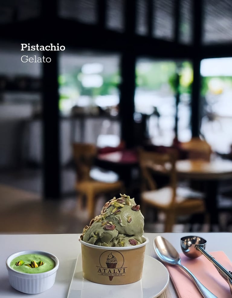
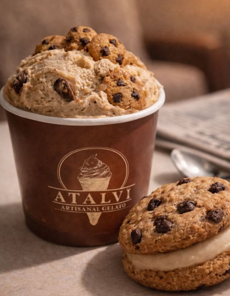
DESIGN · Consistency across every surface
Design choices that made the premium price believable.
Color Palette — Italian café, not local parlour
6B2F1F
A9785F
6A4A3E
5A4F1F
D8A35D
BFAE9D